Real Room Update: Adding Layers
If you guys remember, back in November I shared some pics of my parent's master bedroom in their Cape Cod home. Since this room was just added on a couple of years ago when they renovated the whole place, they're still furnishing and designing this space. Mom's made some recent updates and I thought it would be nice to share...plus we're going to ask for your help soon on one design dilemma that's puzzling them:)
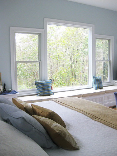
This is the perfect example of how layers are built up in a room as you go. More often than not, beautiful and personal rooms don't come together in a day. You acquire bits over time, tweak things, keep refining and fine tuning.
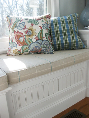
The real focal point in this room (besides the bed) is this huge wall of windows and built-in bench and storage. To kick off the room, Mom had custom seat cushions (in an oatmeal and blue window pane) and two throw pillows (in blue and green plaid) made by a local seamstress. This is where we left off last time.
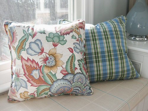
I suggested that Mom get some more pillows to keep these guys company. We all agreed that some more pattern would be helpful. And in the comments, Holly said ""If they are up for it (your dad really I should say) I think some throw pillows in a large floral would be nice...".
Mom was reading and paying attention! Last time we went down the Cape to visit, she couldn't wait to show me the new pillows she found at a local consignment shop. For like $14 each! And she said they looked brand new:)
I love the floral with the plaid and I really like how this one small accessory adds a lot more colors (than just blue and beige) to the room. (I'm finding that I like rooms with more than just one or two colors in their palettes.)
She had Pottery Barn linen panels in pretty much that same beige/taupe/oatmeal color as the seat cushions stored away from their previous house in PA (as well as a thicker, chunkier ORB rod and rings) and thought they would work well in this room. Once up, they are definitely more suited. They just feel more substantial and dramatic, add organic texture, tie in better with the other fabrics in the room and even closely mimic the color of the painted dressers. This time Mom hung the rod right up to the ceiling which makes a big difference.
 {after drapery update}

Its just these continuing little additions of layers that add depth and personality to a space. Aren't we always looking around and thinking about what small tweak or change or extra thing will make our homes that much better?

This is the perfect example of how layers are built up in a room as you go. More often than not, beautiful and personal rooms don't come together in a day. You acquire bits over time, tweak things, keep refining and fine tuning.
The real focal point in this room (besides the bed) is this huge wall of windows and built-in bench and storage. To kick off the room, Mom had custom seat cushions (in an oatmeal and blue window pane) and two throw pillows (in blue and green plaid) made by a local seamstress. This is where we left off last time.
I suggested that Mom get some more pillows to keep these guys company. We all agreed that some more pattern would be helpful. And in the comments, Holly said ""If they are up for it (your dad really I should say) I think some throw pillows in a large floral would be nice...".
Mom was reading and paying attention! Last time we went down the Cape to visit, she couldn't wait to show me the new pillows she found at a local consignment shop. For like $14 each! And she said they looked brand new:)
I love the floral with the plaid and I really like how this one small accessory adds a lot more colors (than just blue and beige) to the room. (I'm finding that I like rooms with more than just one or two colors in their palettes.)

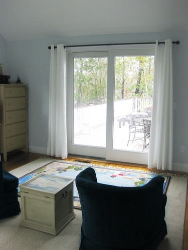
The next layer that Mom recently added was "better" drapes. When they first got settled in this room, they needed something quick to block off the slider here to the deck, mostly just for privacy. So Mom hung these white curtains from Ikea on an oil-rubbed bronze rod (also from Ikea). It did the trick, but she always had real plans for this slider.
She had Pottery Barn linen panels in pretty much that same beige/taupe/oatmeal color as the seat cushions stored away from their previous house in PA (as well as a thicker, chunkier ORB rod and rings) and thought they would work well in this room. Once up, they are definitely more suited. They just feel more substantial and dramatic, add organic texture, tie in better with the other fabrics in the room and even closely mimic the color of the painted dressers. This time Mom hung the rod right up to the ceiling which makes a big difference.
 {after drapery update}
Lastly, for now, Mom and Dad had these two framed landscape prints that they wanted to put somewhere in the room. I suggested stacking them vertically to the right of the slider in an effort to start creating some other little moments in the room, as well as begin to bring your eye around from the adjacent huge and dramatic window wall.

Its just these continuing little additions of layers that add depth and personality to a space. Aren't we always looking around and thinking about what small tweak or change or extra thing will make our homes that much better?

Next up...Mom and Dad and I need your help with a potential issue in this room. I'll be back to talk about it and present some photoshop mock ups in my next post. (Not sure when that will go down, hopefully by the end of the week.) Thanks, guys!


I have such a problem settling on window treatments. I like how the PB ones and how they add fullness and softness to the space.
ReplyDeleteFirst of all, the updates are great --- I love the fullness of the new curtains and those floral pillows are beautiful.
ReplyDeleteBut, I also really love your point about how a room evolves and has many layers. So often I push to pull everything together at once and it just feels stressful and forced. I think your message is a good reminder to let rooms grow organically. They'll be so much better for it in the long run.
Hooray Mrs. (whatever your maiden name was)!! The pillows look great and really open up the options as far as the color palette is concerned too - now they can add in some greens or reds - lots of possibilities. The room is really coming together nicely, and I really like the new addition of the heavier curtains and the hardware pushed up higher (great move!!) and the artwork is beautiful nestled in that corner. I'm so excited about this!! And looking forward to more updates and hopefully helping with the dilemma.
ReplyDeleteWhat pretty progress! It's amazing what a difference such subtle changes can make. So, pretty Sarah. I'm looking forward to seeing how the room evolves. I'd kill for a room that size!
ReplyDeleteOh and thanks for your sweet comments on my St.Patrick's Day post. I'm glad you found a veggie Maura likes!
It's true. A room isn't ever really finished. There's always moving and tweaking and switching around going on. What is interesting about your mom's space is how big the differences are for such relatively small changes. The curtain rod and drapes alone make me want to switch all mine out to chunky ORB and hang all my drapes from rings.
ReplyDeleteI find the combination of blue and green can be fun, fresh, calming even though the shades can be so different. The pillows are perfect and were such a great find.
ReplyDeleteSarah, it's obvious where you get your great taste! Love what your mother has done (think I've said that before) and love the direction this room is going. Subtle layers make a room look lived in, acquired over time and warm!
ReplyDeleteDenise
The new curtains are pefect - great drapes and beautiful colour! I love the pretty landscape prints too - I'm sure this space will evolve into a beautiful, comfortable room.
ReplyDelete