Real Rooms: Cape House Master Bedroom
Thanks so much for all your great comments about the porch in my parent's house! (See more of their style here.) Thought you guys might like to see how their new master bedroom is coming along. It's definitely not done yet, but the progress so far is really great.
As you can see here, the current master suite did not exist in the old house. Part of the renovation was to add on to the back of the house, making the basement bigger (the lower part here) and creating a new master bedroom and bathroom (the upper part, which is ground level in the front of the house).


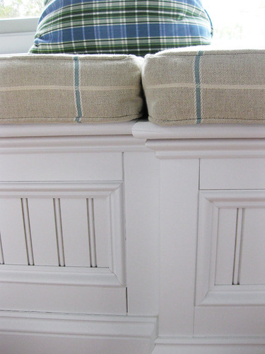
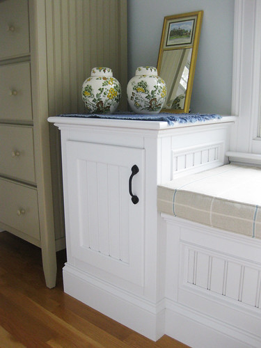
Look at those gigantic windows that run along the back of the addition, they're the best part of the new master! (These things are huge, its hard to tell the scale here, but if you compare their height to the throw pillow, you get a sense of the grandness of this wall.) Mom had a window seat bench (with storage inside - there are hinged lids running along the whole thing) and two cabinets (one on either end of the of bench) built in and fronted with bead board. As far as window treatments here go, the backyard backs up to woods so its very private. Mom is thinking custom roman shades. Thoughts?
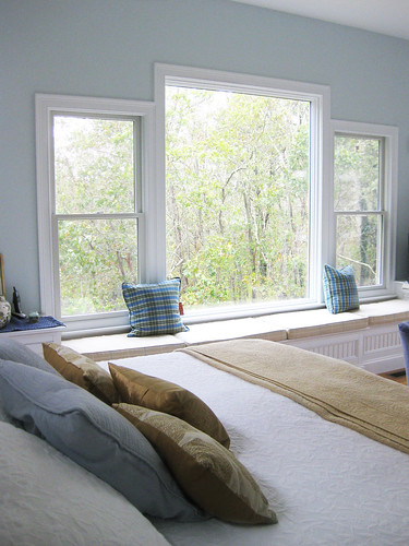

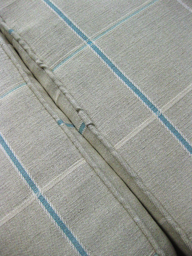
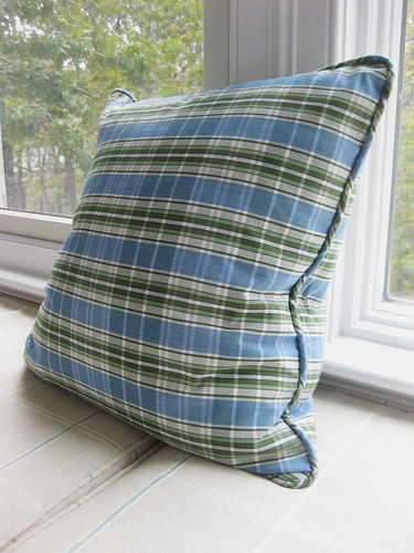
She recently had a local seamstress/upholsterer create cushions for the bench. I'm not very good at fabric speak, so all I can tell you is that its a lovely beige, blue and white windowpane. Mom also had two throw pillows made in a coordinating green and blue plaid. (I told her she might need some more pillows...and move them to each corner of the bench, coming in towards the center. What do you think? Suggestions for other types of prints/patterns/colors that would work here?)
When you walk into the room, the above window/bench wall is the first thing you see. The wall that the bed is on is to your left. While working with the architect, Mom and Dad changed any normal size windows on this wall to a high, long transom window, because there would otherwise have not been a spot with big enough wall space to fit the bed! They are outfitting this room with some new things while still keeping some of the things they already had. Mom found the wrought iron bed frame at Overstock.com (she wanted something light and airy here). The white matelasse coverlet she already had, as well as the two solid blue throw pillows (I suggested swapping those out for something in a pattern, maybe that has both blue and the warmer beige/gold/taupe in it?). She scored the leaf pillows recently at Home Goods.
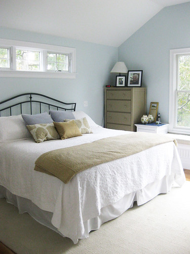
In the rest of the downstairs, the walls are all a light taupey-beige (I'm pretty sure its Benjamin Moore's Manchester Tan...that or Bleeker Beige). Mom wanted more of a coastal/beachy cool palette in here so she had the walls painted in a light grey-blue. In an effort to make it still blend in with the rest of the house though, she likes the idea using the taupe/beige as an accent color in here. She bought two tall painted lingerie chests (in this mushroom color) from a local furniture store and positioned one at either end of the window bench built in.
Across the room from the bed, or the wall on the right when you walk in, is a slider out to the back deck. (See the other mushroom lingerie chest there in the corner?) For now Mom has these white drapes from Ikea hanging here, but she is considering replacing them with some really nice oatmeal linen panels (from PB) that she already has from another room and isn't using. Might be a nice tie in to the fabric on the window bench. What do you think? (She also plans on swapping out the rod for something more substantial and hanging it, and the drapes slightly higher.
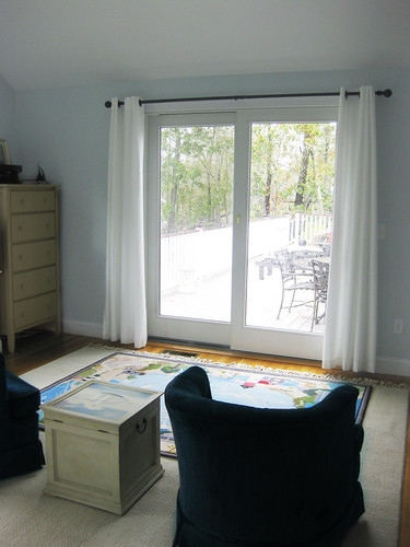
Square footage wise this room is really big. So Mom wanted a sitting area here by the sliding door. In an effort to save on the budget, she's using these two navy, velvet, round club chairs that she already had. Us kids got her this hand-hooked rug by Claire Murray for Christmas one year (she really wanted one, its very Cape Cod). She doesn't want to cover up any part of the coastal scene, or beautiful craftsmanship, of the rug with the chairs:)

Last but not least is the fourth wall, or the wall that you enter the room on. Its the wall of storage! I love the high ceilings in here, and it meant that Mom and Dad could have the builder add in these little storage cubbies above their closets. (I secretly wish that the handles/hinges on the closet doors were oil-rubbed bronze too instead of brass, but oh well!)
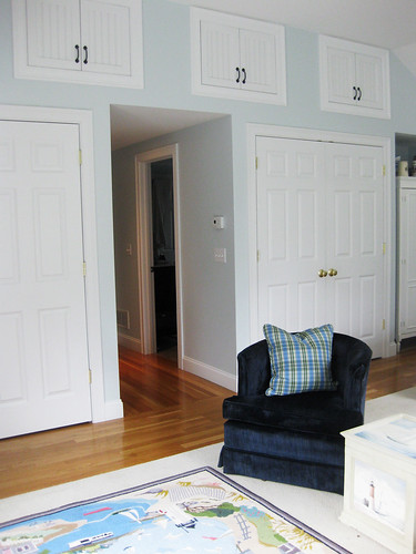

Mom's concerned that the wall with the huge windows and bench and lingerie chests is slightly overpowering everything else and might be putting the room off balance (especially because the opposite wall - this one with the closets - is so white and doesn't have that much going on). What do you think? Any suggestions for how to add weight to other areas of the room? Ideas for anything else in here in general? Thanks so much!
As you can see here, the current master suite did not exist in the old house. Part of the renovation was to add on to the back of the house, making the basement bigger (the lower part here) and creating a new master bedroom and bathroom (the upper part, which is ground level in the front of the house).


Look at those gigantic windows that run along the back of the addition, they're the best part of the new master! (These things are huge, its hard to tell the scale here, but if you compare their height to the throw pillow, you get a sense of the grandness of this wall.) Mom had a window seat bench (with storage inside - there are hinged lids running along the whole thing) and two cabinets (one on either end of the of bench) built in and fronted with bead board. As far as window treatments here go, the backyard backs up to woods so its very private. Mom is thinking custom roman shades. Thoughts?


She recently had a local seamstress/upholsterer create cushions for the bench. I'm not very good at fabric speak, so all I can tell you is that its a lovely beige, blue and white windowpane. Mom also had two throw pillows made in a coordinating green and blue plaid. (I told her she might need some more pillows...and move them to each corner of the bench, coming in towards the center. What do you think? Suggestions for other types of prints/patterns/colors that would work here?)


When you walk into the room, the above window/bench wall is the first thing you see. The wall that the bed is on is to your left. While working with the architect, Mom and Dad changed any normal size windows on this wall to a high, long transom window, because there would otherwise have not been a spot with big enough wall space to fit the bed! They are outfitting this room with some new things while still keeping some of the things they already had. Mom found the wrought iron bed frame at Overstock.com (she wanted something light and airy here). The white matelasse coverlet she already had, as well as the two solid blue throw pillows (I suggested swapping those out for something in a pattern, maybe that has both blue and the warmer beige/gold/taupe in it?). She scored the leaf pillows recently at Home Goods.

In the rest of the downstairs, the walls are all a light taupey-beige (I'm pretty sure its Benjamin Moore's Manchester Tan...that or Bleeker Beige). Mom wanted more of a coastal/beachy cool palette in here so she had the walls painted in a light grey-blue. In an effort to make it still blend in with the rest of the house though, she likes the idea using the taupe/beige as an accent color in here. She bought two tall painted lingerie chests (in this mushroom color) from a local furniture store and positioned one at either end of the window bench built in.

Across the room from the bed, or the wall on the right when you walk in, is a slider out to the back deck. (See the other mushroom lingerie chest there in the corner?) For now Mom has these white drapes from Ikea hanging here, but she is considering replacing them with some really nice oatmeal linen panels (from PB) that she already has from another room and isn't using. Might be a nice tie in to the fabric on the window bench. What do you think? (She also plans on swapping out the rod for something more substantial and hanging it, and the drapes slightly higher.

Square footage wise this room is really big. So Mom wanted a sitting area here by the sliding door. In an effort to save on the budget, she's using these two navy, velvet, round club chairs that she already had. Us kids got her this hand-hooked rug by Claire Murray for Christmas one year (she really wanted one, its very Cape Cod). She doesn't want to cover up any part of the coastal scene, or beautiful craftsmanship, of the rug with the chairs:)

Last but not least is the fourth wall, or the wall that you enter the room on. Its the wall of storage! I love the high ceilings in here, and it meant that Mom and Dad could have the builder add in these little storage cubbies above their closets. (I secretly wish that the handles/hinges on the closet doors were oil-rubbed bronze too instead of brass, but oh well!)


Mom's concerned that the wall with the huge windows and bench and lingerie chests is slightly overpowering everything else and might be putting the room off balance (especially because the opposite wall - this one with the closets - is so white and doesn't have that much going on). What do you think? Any suggestions for how to add weight to other areas of the room? Ideas for anything else in here in general? Thanks so much!


Wow. Gorgeous. Just flipping gorgeous.
ReplyDeleteReally pretty. The window is just divine! It makes me think of Cottage Living for some reason. Thanks for sharing!
ReplyDeleteOooh that addition is really great Sarah! Ok, I'm going to try to answer as much as I can and then I might have to get back to you after I think about it some more. Those built in storage benches are awesome. If they are up for it (your dad really I should say) I think some throw pillows in a large floral would be nice for that seating area. Perhaps even a small print too to break up the plaid. You could bring out some of that blue in the plaid. As far as the curtains, I really like those and I think you could do a few different things with them. One option would be to add a trim to the edges to give them a different look or even add some fabric to the bottom of the panels that would coordinate with the pillows or cushions. This is getting to be a long comment - I'll send you an email if I think of other things. Fun post Sarah - I love this stuff!!
ReplyDeleteForgot to mention that I love your Mom's pillows from homegoods - those look really pretty.
ReplyDeleteSuch a pretty room. It's funny because my parents are also in the middle of a huge remodel of their Cape Cod. When I showed the first couple of pics to my husband I had to convince him that it wasn't their house.
ReplyDeleteWhat a fantastic room! It just feels relaxing and like you're at the Cape in there. I'm loving these looks inside their home. Thanks for sharing!!
ReplyDeleteJust beautiful! I love the color scheme and the gorgeous built ins in here.
ReplyDeleteIf this isn't "Cape Cod style", then I don't know what is!
OajVsw [url=http://www.nikes-cheapjerseys.com/]Cheap MLB Jerseys[/url] YymAtq http://www.nikes-cheapjerseys.com/
ReplyDeleteNjtDtb [url=http://www.usaauthentic4cheapjerseys.com/]Cheap NBA Jerseys[/url] UujVej http://www.usaauthentic4cheapjerseys.com/
McwVec [url=http://www.authentic2cheapjerseys.com/]Cheap Authentic MLB Jerseys[/url] KlfKyu http://www.authentic2cheapjerseys.com/
JpkYqq [url=http://www.nikes-cheapjerseys.com/]Customized NFL Jerseys[/url] FpcQfr http://www.nikes-cheapjerseys.com/
ReplyDeleteYyqOcl [url=http://www.usaauthentic4cheapjerseys.com/]Cheap Authentic NFL Jerseys[/url] EdqUxn http://www.usaauthentic4cheapjerseys.com/
IhfRcv [url=http://www.authentic2cheapjerseys.com/]Cheap Authentic NHL Jerseys[/url] GaeUtn http://www.authentic2cheapjerseys.com/