Living Room Update: New Throw and Painted Mats
I've never been totally happy with our living room. I'm currently trying to get rid of as much of the yellow/gold tones in here that I can, along with adding more cool colors...which is hard with a caramel colored sofa, gold fabric roller shades and a rug that has more yellow in it than expected when I purchased it. I was hoping some quick, small fixes would at least be a step in the right direction.
.

Then, because those pale yellow mats on the botanical prints were bugging me so much, I did something slightly crazy. Painted them white! This was not expensive, treasured art...there's not even glass in them, so I wasn't worried about screwing them up by accident. Figured what did I have to lose?

Taped up the frames so I wouldn't get paint on them and just went to town with a brush (I normally use for trim or cutting in) and some random flat white paint. I used a little artist brush to do the inner border where the yellow mats meet the artwork (that green border). I did two light coats and they turned out totally fine. You can only see the brush strokes if you look up close and then it sort of just has a textured mat appearance to it.

{after}
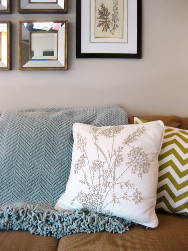
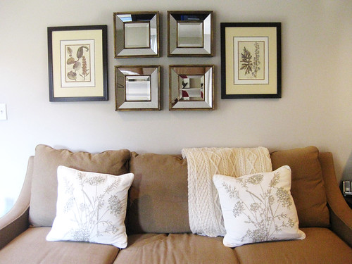
Here's a before of the little sofa corner of the room. Remaining untouched or in place: the couch, the 4 beveled mirrors (from Michaels a long time ago), the cream and taupe crewel floral pillows from Pottery Barn. I like these two botanical prints that I nabbed at HomeGoods, but the outer, buttery yellow mats have always bugged me. They're only helping to add to that "too many warm tones" in here. Love this wool blanket from Ireland that my mother-in-law gave us, but I can use it and enjoy it in another room in the house. {before}
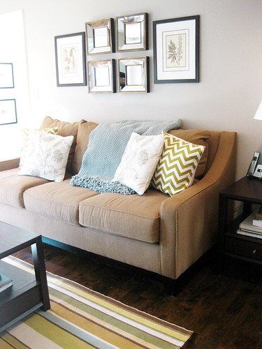
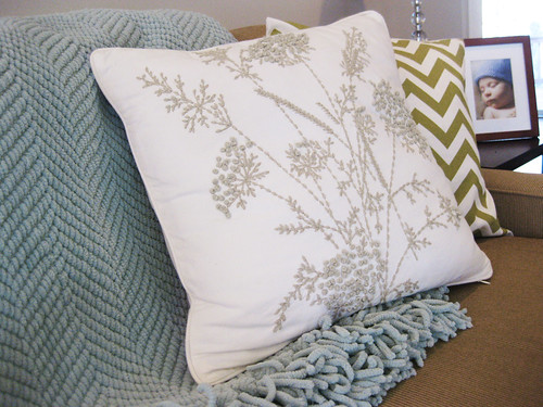
Here's the same spot after. One of my favorite colors is that lovely shade between blue and green and grey...I want to incorporate that more around the house. So I asked for this Grand Chenille Throw in Blue Smoke from Pottery Barn for Christmas. (It's super soft, but in person is just a touch more on the green side of blue than it reads in the catalog or online.) To add another layer and even more color here (that's not gold!), I moved my olive green chevron pillows (from etsy seller milk and cookies) over from their usual spots on the leather club chairs that face this sofa. (Now I want to find new throw pillows for the chairs in a pattern than incorporates both this sea foam/robin's egg blue and green - domino effect!).
{after}
Then, because those pale yellow mats on the botanical prints were bugging me so much, I did something slightly crazy. Painted them white! This was not expensive, treasured art...there's not even glass in them, so I wasn't worried about screwing them up by accident. Figured what did I have to lose?
Taped up the frames so I wouldn't get paint on them and just went to town with a brush (I normally use for trim or cutting in) and some random flat white paint. I used a little artist brush to do the inner border where the yellow mats meet the artwork (that green border). I did two light coats and they turned out totally fine. You can only see the brush strokes if you look up close and then it sort of just has a textured mat appearance to it.
{in progress}
I'm definitely a lot more happy with this part of the room after these quick changes. And I like how it's looking with the rug. Heads up, it doesn't look like this often. This is where Maura likes to read and color and play behind the cushions. Oh well:)


A beautiful, quick update Sarah! It looks awesome. I love the addition of the new throw and pillows. You are proof of quick fixes. Enjoy your new look!
ReplyDeleteIt looks great! Amazing what a difference changing the mat color makes. I painted a mat recently to an orange and it was super easy with a huge impact. Love the pillows!
ReplyDeleteSarah there is nothing better than small, inexpensive changes to make a room sing! I think that's why it is important to keep tweaking and not be in a hurry to get it all right! Love your choices!
ReplyDeleteCathy
I love your changes .... especially the new pillows! The green is lovely. I always buy super inexpensive frames and mats, because they are just so easy to paint. And, that little paint makes such a huge difference :)
ReplyDeleteSounds like something I am trying to accomplish..less yellow and more combining warmer tones like gold and caramel with silver and other hues. It is evolving, Sarah
ReplyDeleteLooking good! So smart to change the color of those mats. A little update that makes all the difference.
ReplyDeleteI love the choice of colors! Very pretty
ReplyDelete