Summer Vignettes: Foyer Bookcase
Layla and Kevin's Summer Fun Link Party is still in effect (those guys know how to have a good time!), so I figured I'd share our foyer bookcase for summer while we're at it.
So, to really check this out, you kinda have to stand far back. 'Cause I went big this time. I've been wanting to do something cool with the two vintage oars I won in a giveaway from Frugal Farmhouse Design this time last year. I'm considering hanging them above the couch in our family room (and taking down the black ledge shelves) but for now I decided to break them out for the summer foyer bookcase. I knew I wanted them on top, leaning against the wall (we have a lot of open space there since its two stories). I was hoping I could cross them over each other in a "X", but they just wouldn't stay:( After playing around with them a bit, this was the best and safest (don't want them falling down on the ol' toddler!) formation I could come up with.
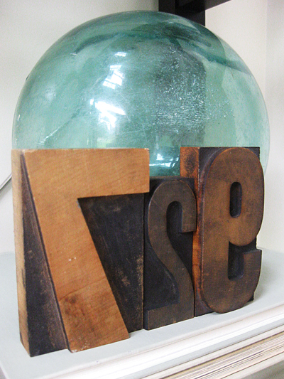
Next up, I added the vintage glass fishing float that my mom got me last year for Mother's Day. I love the color it brings to the vignette, plus it helps rock the nautical vibe without being too over-the-top cheesy. I wanted some more brown and wood here, so these old letterpress printing blocks (from my first ever trip Brimfield) did the trick. (Plus, they are for our wedding anniversary, July 29th, which is right in the middle of the summer.)
To pick up on the cool, rustic, textured oars at the top, I added my piece of driftwood that I found on a beach on one of our summer visits to Prince Edward Island, Canada. Behind it is a smaller version of the brushed silver shadowbox frame from the mantel with another Vintage Printable seashell print (I made sure to choose one that had some blue and green in it to coordinate).
Lastly, I just had to switch out the books on the bottom shelf for new ones in sea foam and green, and I felt like everything (color, shape, size) was balanced:)
Thanks again, Layla!! The weather here has been HOT (like in the 90s) the last few days, so I'm finally feeling like summer is here, yay!


Love that print! Thanks for the link too!
ReplyDeleteI think those oars is how I found your blog last year and then made the Doylestown connection - those are great to have and you've incorporated them well. One of these days I'll find something on VP that I end up using - your print looks great. Stay cool this weekend!
ReplyDeleteThe placement of the oars is brilliant. Love how it draws the eye straight up to the second floor. How creative :)
ReplyDeleteDon't mind me...just scouring your entire blog for pictures of your floors. Damn you...was all convinced to just go natural and save the money but I LOVE how your's look!!!! I'm not totally convinced I could get this same look with 100 year old wood but it looks amazing. I am currently leaning toward putting the money I'd save by keeping them natural toward the C&B Colette bed. How's that for a trade-off? LOL!
ReplyDelete