Real Room Dilemma: To Paint or Not to Paint
Hi! Thank you so much for all your super nice comments on the updates to Mom and Dad's master bedroom! If you don't mind, I'm going to talk about it a little more today. (Sorry, it took me way longer to put this post together than I thought, so I wasn't able to publish it last week.) Mom, Dad and I are hoping you guys can help us figure out if their bedroom has a problem or not, and if so, what to do about it. Heads up...this post is kinda long, hang in there if you have time:)
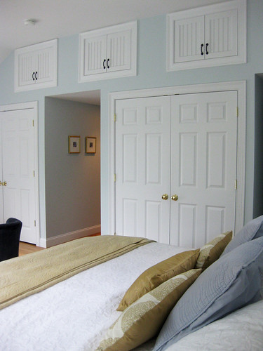
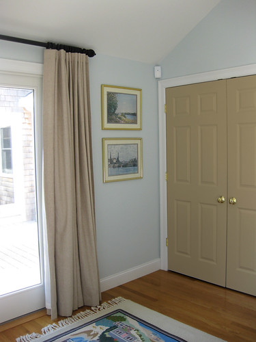
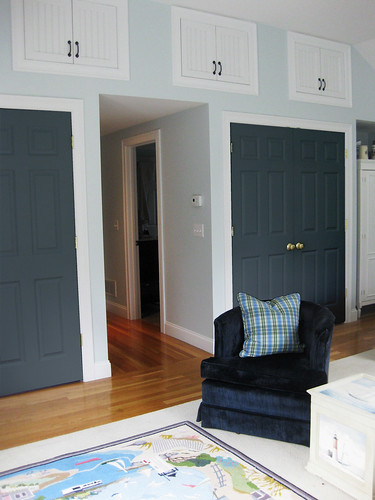
Mom and Dad are thinking that their room is visually a little bit off balance. They have major things going on three of the walls (with a lot of contrast and color), but one of them, the wall with both their closets on it, is kinda blah with no real focal point or drama. (Its all very light - two sets of large white closet doors, three small white storage cubby doors and a big white armoire.)
Here's the culprit wall:

To help you guys understand the layout better and give you an idea of how the color is spread throughout the room, I quickly put together this floor plan:

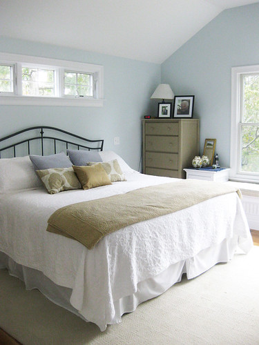
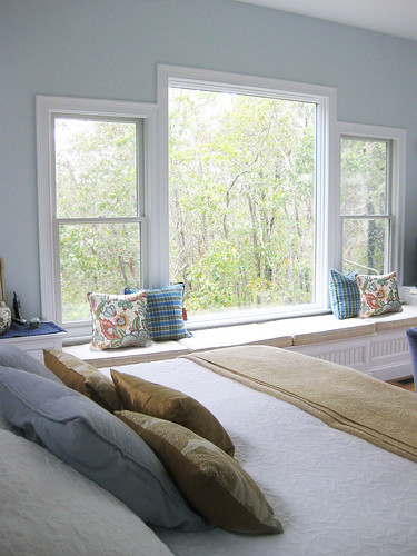
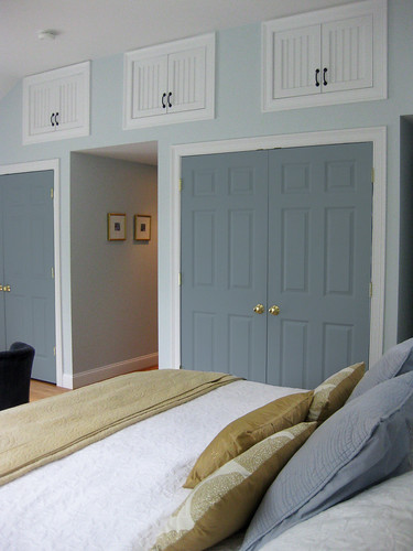
And here's the accompanying photos as if you are walking into the room via the hallway on the wall of closets - on the left is the bed wall, then straight across is the wall of windows with the built-in bench and painted dressers, and on the right wall is the slider (with new window treatments) out to the deck:

They are worried that the room is just too heavy in specific areas and want to remedy that by doing something to the fourth wall that will tilt that side of the room back into balance and leave everything feeling a bit more harmonious. Their first thought (other than admitting they think they have a problem!) is to paint both sets of closet doors something other than white. Therefore giving your eye a place to travel to on this side of the room. (We also thought that instead of touching the closets, that they could paint that white armoire something other than white, but I did some Photoshop tests and we think its not enough.)
Now, Mom and Dad are no strangers to painted interior doors. They are not afraid to take the risk. They had all the downstairs doors in their old home painted high-gloss black (don't mind the Christmas decor)...
Here's where you guys come in. Do you agree with them that the room does seem a bit off balance? Do you like the idea of painting the closet doors and think this will help? Do you have any other suggestions for a solution?
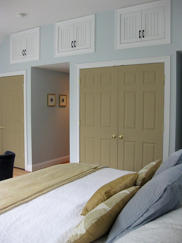
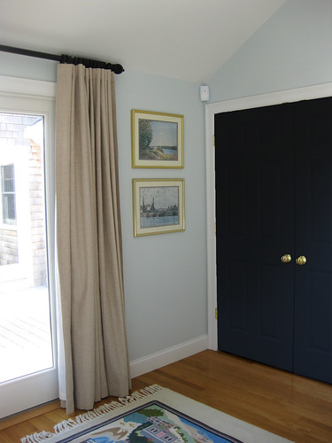
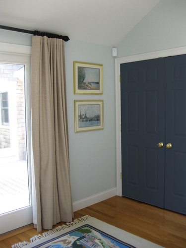
If you do agree that painting the doors might solve the problem, here's some Photoshop mock-ups I did for you (and Mom and Dad) to test out some possible colors (I've tried each color in three different views so you hopefully really get a sense of how it would look):


Mom and Dad are thinking that their room is visually a little bit off balance. They have major things going on three of the walls (with a lot of contrast and color), but one of them, the wall with both their closets on it, is kinda blah with no real focal point or drama. (Its all very light - two sets of large white closet doors, three small white storage cubby doors and a big white armoire.)
Here's the culprit wall:
To help you guys understand the layout better and give you an idea of how the color is spread throughout the room, I quickly put together this floor plan:
And here's the accompanying photos as if you are walking into the room via the hallway on the wall of closets - on the left is the bed wall, then straight across is the wall of windows with the built-in bench and painted dressers, and on the right wall is the slider (with new window treatments) out to the deck:
They are worried that the room is just too heavy in specific areas and want to remedy that by doing something to the fourth wall that will tilt that side of the room back into balance and leave everything feeling a bit more harmonious. Their first thought (other than admitting they think they have a problem!) is to paint both sets of closet doors something other than white. Therefore giving your eye a place to travel to on this side of the room. (We also thought that instead of touching the closets, that they could paint that white armoire something other than white, but I did some Photoshop tests and we think its not enough.)
Now, Mom and Dad are no strangers to painted interior doors. They are not afraid to take the risk. They had all the downstairs doors in their old home painted high-gloss black (don't mind the Christmas decor)...

Here's where you guys come in. Do you agree with them that the room does seem a bit off balance? Do you like the idea of painting the closet doors and think this will help? Do you have any other suggestions for a solution?
If you do agree that painting the doors might solve the problem, here's some Photoshop mock-ups I did for you (and Mom and Dad) to test out some possible colors (I've tried each color in three different views so you hopefully really get a sense of how it would look):
No. 1: A similiar mushroom/taupe color as the two painted dressers and accent pillows/throw on the bed.
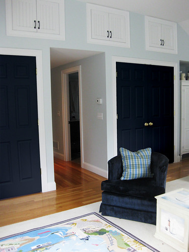
No. 2: Some dark shade of navy blue
No. 3: A medium, muted grey-blue
No. 4: A subtle, light grey-blue (maybe like slightly darker version of the wall color?)
No. 5: Something more on the green side, but still light and muted.
Phew! If you are still reading, thank you so much for your time and help! What do you think? Do you like any of these color ideas? Is there another color we haven't considered that you think might be better? Thoughts on this in general? You guys are awesome!!


I think the Navy is spot on! I gasped when I saw I loved it so much!
ReplyDeleteThe muted gray blue would be my choice.
ReplyDeleteI like option number 4 the best, or leaving them white would work as well because of how light and airy the room is. Of course, I like the darker as well for some contrast!
ReplyDeleteHave they considered painting the cubby doors? Maybe it would help simplify the wall if the cubby doors and trim were all painted wall color to blend in a bit. It just seems a little cluttered with all the different doors on that one wall. Just a suggestion and good luck with your project!
Laura
www.HappyroostBlog.com
I like the medium grey blue, slightly darker than the wall color. I also think Laura's idea of painting the cubbie doors/trim the same as the wall color is worth noodling around with on photoshop! How did you do up your floorplan Sarah? I love seeing all of the colors and pattern on the plan!
ReplyDeleteCathy
My favorite is option #4. The room looks fantastic!
ReplyDeleteLove #3 with the muted grey-blue but one that I'd change would be the handles of the upper cabinets. They're so dark that they draw attention to themselves. Perhaps also consider painting the little hallway behind them the same color as the doors.
ReplyDeleteIt's a lovely room.
Definetly No. 2 or No. 3!
ReplyDeleteThis room is beautiful! I love the mock ups of the different paint colors! My absolute favorite is the dark navy paint! It would be stunning on the doors. Also, maybe you could paint the three small cabinet doors at the top the same as the wall color, making them almost disappear. Then your focus could be on the navy doors below. Have fun! It will be beautiful!
ReplyDeleteI was also wondering the same thing as Cathy- how did you draw that floor plan? I loved it!
ReplyDeleteI love the navy!(but I'm always drawn to navy) It's dramatic and ever so slightly nautical without being theme-y and it really sets off the brass doorknobs and the frames of the vertically stacked artwork. The medium grey-blue has a similar effect but is just a little more subtle.
ReplyDeleteLove the mock-up you created!
I really like the black, but here's a wild idea, what about adding mirror panels to the front of the doors. The Lettered Cottage did this and I thought it looked fantastic and allowed light to bounce around the room.
ReplyDeleteI am loving the darkest doors! They lend such sophistication, and with the contrast, real drama. Can't wait to see what you/they choose!
ReplyDeleteThanks so much everyone for the quick response!! So glad you like the idea of painting the doors. Looks like some shade of blue is winning out...but keep the votes coming:)
ReplyDeleteI drew the floor plan by hand in Photoshop. I have one of those tablets and pens so it is much easier and more intuitive. First I drew all the black outlines on one layer and then drew in the various colors and patterns on another layer below that. It is definitely not to scale or anything, but I thought it would be helpful!!
Thank you again!
I am going to be honest here, what is making it feel unbalanced is the taupe in the drapes, I think if you make those lighter your will not have to paint. The other option would be to paint all the doors, top three and bottom two a shade darker than the wall I think if you go too dark it is creating another problem. The one option that came close was the softer blue/gray color, but I would still paint the top three also, otherwise they don't make sense with the over all dsign. Good luck, love the soft blue color of the room, so soothing,
ReplyDeleteKathysue
I love the idea to paint the doors, and I like options 3 and 4 the best. I feel like if you go darker (and I LOVE dark doors), then you'll unbalance towards the other side.
ReplyDeleteI like the green or the tan. The room might coalesce more with new door hardware - ORB on the closet doorknob, and replacing the top cabinet hardware altogether with a blend-in white or ORB in something much cuter than the handles.
ReplyDeleteIf they're really wanting to make a statement, maybe a coral? What about texture, like grasscloth, on the raised panels?
For some reason, I'm not a fan of any of the door colors you've posted. The room still feels like it needs a pop, but I'm not sure it is of another solid color.
ReplyDeleteHave you seen this room? It is a pin of mine that kind of went viral, originally from House of Turquoise. Click into it and see the room from all angles.
http://pinterest.com/pin/42854633923679784/
I feel like the wood paneling in that room, could balance out your parents' room. Would they consider the high panels behind their bed. It could balance out the room. In that other room, too, they did paint a door. Albeit, yellow, but a pop of color could look right when it ties into the room. Possibly consider a lattice patterned rug or something more on the conservative side, but that would tie in a color and pop with it around the room that needs the heaviness balanced out. Good luck!
I had to pop over when I saw your e-mail - mmm...well first I'm very jealous of your parents closet and storage space in their bedroom. It's so nice to have all that space. The thing that sticks out to me is the mismatched hardware, and I prefer the black handles on the upper cabinets. So I would switch out the door knobs first (or brass handles if they prefer the brass) and live with that update for a little while before painting the doors. I'll keep thinking but I would go small with the hardware update first before doing anything else. Keep us posted on what they decide! And I'm with Cathy too - I love your PS mock-up that you did. I was thinking about downloading the 30 day trial of PS Elements but will be a total time crush for me to try to learn that? I love the flexibility and creativity with PS.
ReplyDeleteI LOVE the fourth option! Do it! :)
ReplyDeleteNumber 4 is my favorite, but I think Number 5 is a close runner up!
ReplyDeleteI like the muted gray-blue (the darker version). Pretty!
ReplyDeleteI love, love, love the navy doors! It Adds an element of sophistication to the room
ReplyDeletei googled muted light blue and found this. i love it, i might as well vote, right? lol. i definitely vote Number 4!
ReplyDeleteI do like 4 or 5. But what about changing out the brass knobs to oil rubbed or brushed nickle first. That may help make your decision easier.
ReplyDeletePop those upper doors off to
ReplyDeletecreate a beautiful display space -
then add lighting for ambiance.
Agree that lower door hardware needs to go.
#5 green is my fave
ReplyDelete