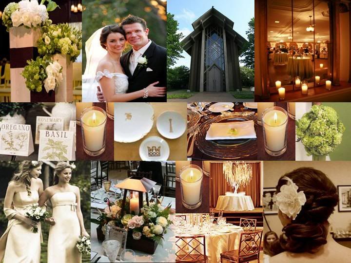
moss + cocoa
I love green and brown together! In the last few years, brown has become the new black, getting paired with sky blue or pale pink or aqua to create lots of fresh new wedding palettes. Gray is emerging now as another neutral color to serve as that solid base to your accent colors.
But for now, let's talk about the rustic, woodsy and organic combo of moss and cocoa:) This is Erin and Josh's custom invite set that I designed for their fall wedding last year. This is the same pocketfold format as Mikki and Scott's invitations that I featured last week (main invitation on the left, inserts layed out vertically in the pocket on the right), but with a much different look and feel.
Erin and Josh had their ceremony and reception at the Whispering Pines Conference Center in Rhode Island. They definitely let the venue set the tone for their big day (or they made sure to pick a venue that fell right in line with their vision). Whispering Pines is a beautiful country estate, surrounded by acres of forests and lakes. The atmosphere of the main lodge and quaint details like a campfire at the reception led Erin and Josh to want something rustic and nature-inspired for their invitations.
Besides the earthy palette of green and brown, we decided to incorporate botanical illustrations of some of the local flora indigineous to the area where they were getting married. Josh's occupation as a landscape designer (or some other such thing that involved knowing alot about plants) also made this choice even more personal. He wanted the invitations to feel almost like a little field guide to all the beautiful trees and flowers guests would see if they wandered around Whispering Pines. We included both the latin and common names for each of the 5 species we featured (printed in a rich chocolate brown).

Erin and Josh wanted to include some natural materials, so instead of wrapping the outside of the pocketfold with ribbon, we used jute (from Lowes!). A wide paper sash printed with the bride and groom's name as well as one of the botanical illustrations set the tone for the inside of the set.


 {And paper-bag colored/kraft paper envelopes really sealed the deal!}
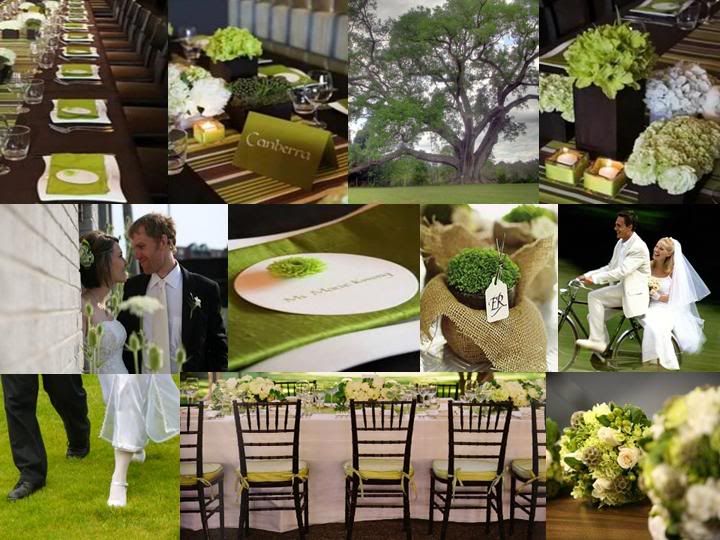
Love these nature-inspired green and brown inspiration boards from Snippet & Ink and The Perfect Palette:
But for now, let's talk about the rustic, woodsy and organic combo of moss and cocoa:) This is Erin and Josh's custom invite set that I designed for their fall wedding last year. This is the same pocketfold format as Mikki and Scott's invitations that I featured last week (main invitation on the left, inserts layed out vertically in the pocket on the right), but with a much different look and feel.
Erin and Josh had their ceremony and reception at the Whispering Pines Conference Center in Rhode Island. They definitely let the venue set the tone for their big day (or they made sure to pick a venue that fell right in line with their vision). Whispering Pines is a beautiful country estate, surrounded by acres of forests and lakes. The atmosphere of the main lodge and quaint details like a campfire at the reception led Erin and Josh to want something rustic and nature-inspired for their invitations.
Besides the earthy palette of green and brown, we decided to incorporate botanical illustrations of some of the local flora indigineous to the area where they were getting married. Josh's occupation as a landscape designer (or some other such thing that involved knowing alot about plants) also made this choice even more personal. He wanted the invitations to feel almost like a little field guide to all the beautiful trees and flowers guests would see if they wandered around Whispering Pines. We included both the latin and common names for each of the 5 species we featured (printed in a rich chocolate brown).
Erin and Josh wanted to include some natural materials, so instead of wrapping the outside of the pocketfold with ribbon, we used jute (from Lowes!). A wide paper sash printed with the bride and groom's name as well as one of the botanical illustrations set the tone for the inside of the set.
{And paper-bag colored/kraft paper envelopes really sealed the deal!}*******
Love these nature-inspired green and brown inspiration boards from Snippet & Ink and The Perfect Palette:


Gorgeous!!! I <3 paper!
ReplyDeleteBeautiful Work! If I hadn't had my wedding already, I'd be calling you!! :)
ReplyDeletelovely! :)
ReplyDeleteOh wow...I love the thought put into the beautiful invitations. Great job. I bet it was a gorgeous wedding! Why couldn't I have met you BEFORE my wedding?! You're amazing and I just love pretty paper and botanicals and love stories. :)
ReplyDeleteHmmm...I'm thinking I'm going to need help with baby shower invites. ::hint hint::
WOW! This is so perfect. Did you do the botanical illustrations yourself? Pass along any tips you have! I don't know how you do that.
ReplyDeleteEmily
timelesspaper.com/blog
Aw, thank you so much, everyone! It is really rewarding and encouraging to hear positive feedback from people like you who actually know what you are talking about (as opposed to my husband or family, they just tell me everything always looks great!!!).
ReplyDeleteEmily, thanks for thinking that I am good enough to draw those botanical illustrations myself:) Actually though, they are from a clip art book called "Trees and Leaves" by Dover Publications. Dover has an entire series of electronic clip art (each comes with a book so you can see all the drawings and a CD that contains the high-res images). They are all copyright free. I use these all the time - I have ones with decorative borders, one of sea-life, old nautical drawings, wildflowers, insects. This particular book/cd was $14.95 and they are all available on Amazon. Josh (the groom) went through the book and selected the plants that they wanted to use (the ones that he knew grew around Whispering Pines in RI).
Hope that helps! Thanks again!!
You are so talented even without the botanical illustrations! I wish I could design invitations as elegantly as you.
ReplyDeleteThanks for the tip. I just went shopping on Amazon. :D
Emily
timelesspaper.com/blog
Sarah,
ReplyDeleteI responded to a few of your questions on my blog this morning.
Emily
Sarah,
ReplyDeleteYeah I went a little crazy with the Dover! Ha! I had to take a few out of my shopping cart. :D
I definitely recommend Restoration Hardware paint. I have used most of the colors they sell at least once in my house. I am in love with all of them. My kitchen walls are their graphite and the cabinets are sand dollar. My dining room walls are their silver sage. My foyer/stairs are their cappuccino. My upstairs landing/hall is flax. My master bedroom is latte. And you already know that my painting room is in blue sage. See, I love their paint!
Emily